Inky Design System
Our web design system is broadly similar to Inky.xaml from Instagile.WPF, but updated and adapted for the needs of the web. This is not mobile-first but mobile-equal - we want true responsiveness, not Bootstrap-style focus wedges and hero elements that are poorly suited to desktop rich-data.
Metrics
Spacing and block sizes are based on a root variable --the-unit, which is 5px by default. This is used by components at fixed multiples in a geometric progression:
--the-unit-1x--the-unit-2x--the-unit-4x--the-unit-8x
Only the base unit should be changed when theming, not the derived variables. There are also calculated variables for specific kinds of control, which are based on --the-unit but can be changed independently:
--the-unit-fullrow: The height of a 'row' used in scaffolded UI.--the-unit-smallrow: The height of asmall row, usually 2/3 of a full row, used in dense UI like lists.--the-unit-fullfield: The height of a field within a row; effectively, a row minus some padding, but sometimes used outside rows.--the-unit-smallrow: As above for a dense-row field.
Typography
The framework provides four font stacks, each defined as a font-family and a font-weight variable.
--the-ff-ui/--the-ws-ui: User interface text, used for labels and data entry. In practice, this is most text in a business application.--the-ff-content/--the-fw-content: Body text, used for prose. In scaffolded UI, this font face will usually only be seen in headers.--the-ff-action/--the-fw-action: Control text (links, buttons, etc), used to distinguish actions unless they're an inline part of body prose.--the-ff-technical/--the-fw-technical: Special purpose face used when monospacing is required.
Font sizes are usually inherited from the cascade (em units), but some common controls are defined relative to the root set by a browser or the user using rem units. These variables can be set to change those (relatively) fixed sizes:
--the-fs-fullrow--the-fs-smallrow
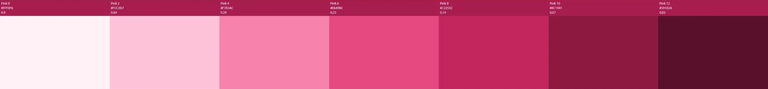
Colours
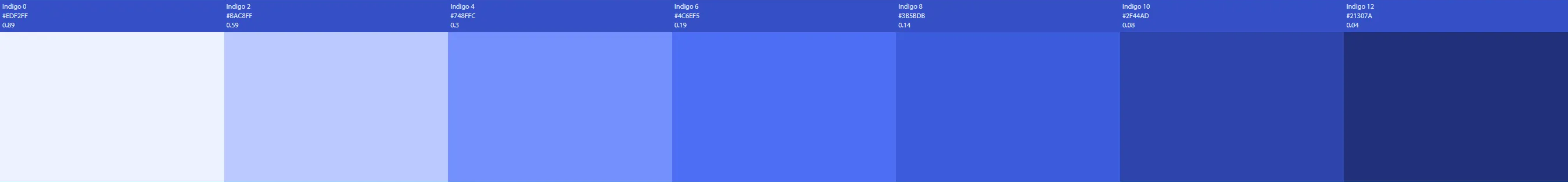
Components use colour themes based on 7-stop ramps. To theme applications, set the variables that define one or more colour ramps, at either at :root or inside some element. The framework has built-in alternative themes: EcoTheme and FrontlineTheme. Primary colours used by most controls:
--the-hue-neutral-0/1/2/3/4/5/6 (data entry and negative space)
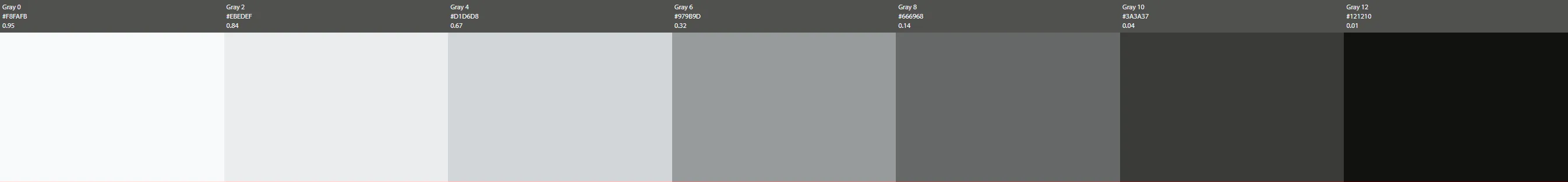
--the-hue-chrome-0/1/2/3/4/5/6 (application shell and page decorations)
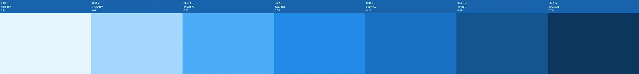
--the-hue-action-0/1/2/3/4/5/6 (controls - links, buttons, etc)
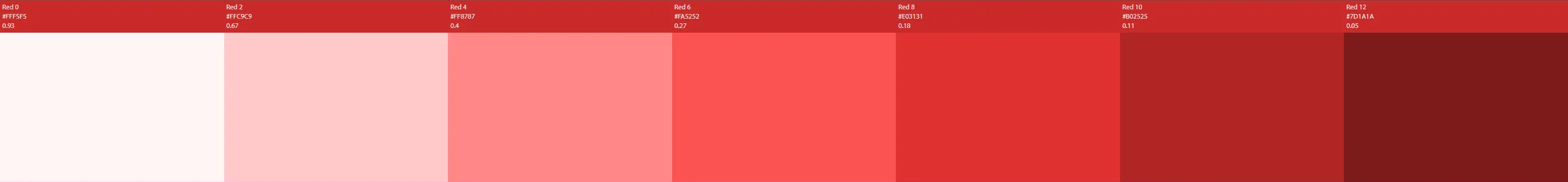
Highlight colours used to indicate data-state and call out user alerts:
--the-hue-error-0/1/2/3/4/5/6
--the-hue-warning-0/1/2/3/4/5/6
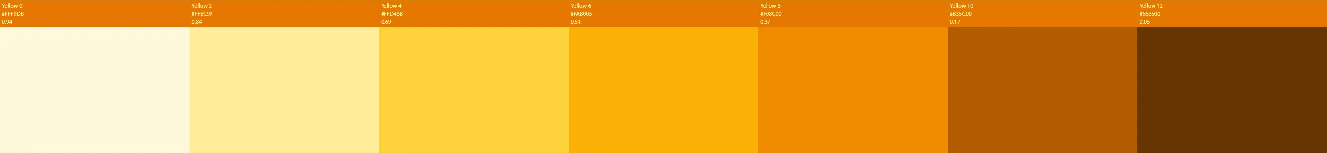
--the-hue-info-0/1/2/3/4/5/6
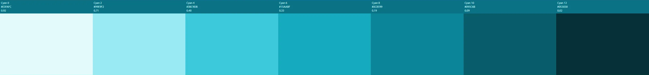
--the-hue-success-0/1/2/3/4/5/6
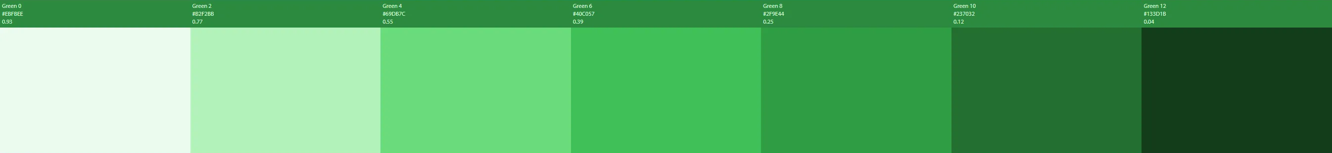
--the-hue-debug-0/1/2/3/4/5/6
Selectors
To enable applications' customisation of components, styles are written with the lowest feasible specificity. We want to allow targeted overrides like
.the-title-bar {
	color: green
}
but also cascading overrides such as
.my-app h1 {
	font-weight: 300;
}
which might be targetting an <h1> inside a <TitleBar>; the style for the latter should be written as
.the-title-bar {
	font-weight: 400;
}
and NOT
h1.the-title-bar {
	font-weight: 400;
}
in order to lower its specificity to the point where the override can apply.
To facilitate this principle, framework components are written using Block Element Modifier methodology. Application components don't need to use BEM unless they're overriding framework styles.